I have a theory that Melbourne’s tram network has a significant impact on the city’s intellectual life. Tram travel is a time for reflection and gathering of thoughts. This article first took shape as I was standing on a tram stop thinking about the Gerard Herbst poster collection at the Ian Potter Museum of Art.

Creative Partners, poster for ‘Public enemies’, 2009
Johnny Depp’s new movie haunts my reverie. It’s not that I’m a fan, he’s just unavoidable right now. Posters promoting the Michael Mann-directed film Public enemies (2009) are plastered across the city. In each an enormous, smirking Depp looms large. So large, in fact, that he displaces the movie itself. What’s being promoted here is not Mann’s latest, ultra-stylish crime flick but Depp himself. It’s his name that dominates, at the head of the poster. The movie title is relegated to the base where its sits as a kind of sly, subsidiary nod to the wanted poster. Even there, it reads more as the caption for a picture of Depp than as the title of a movie.
What’s surprising, and disappointing, about the poster is its utter simplicity. There’s no redeeming it by turning to modernist aesthetics. In good hands less is more, but here less is just less. The whole ensemble, a patchwork of signals rather than a sophisticated design, reads like a glorified passport photograph. And there the paucity of the contemporary movie poster is writ large: what has this crude headshot to do with the meticulous, fanatically elegant stylings of Michael Mann’s vision?
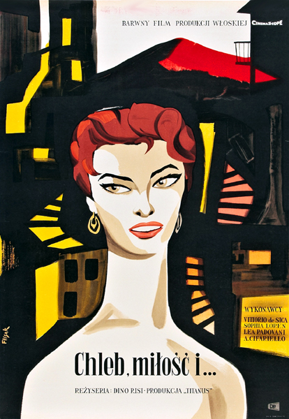
Jerzy Flisak, ‘Chleb, milosc I …’, 1955, colour offset, 84 x 58.5 cm
The shortcomings of so many contemporary film posters are all the more apparent when compared to an example from the golden age: Jerzy Flisak’s poster for Dino Risi’s 1955 romantic comedy, Pane, amore e … (‘Bread, love and … ’; re-titled Scandal in Sorrento for English release) in which Sophia Loren attempts to seduce Vittoria de Sica in order to make her lover jealous.
In Flisak’s design light comedy is given a heart of darkness. The picturesque streets of an Italian village become dark and sinister. The elongated Loren emerges from the shadows like a marauding temptress. Flisak shows a subtle mastery of form, and adds high drama to a flimsy plot premise. Loren’s stretched necked has all the exaggerated elegance of a mannerist Madonna. Her impassive visage has the stony gaze of la belle dame sans merci of Arthurian legend. And those slashing red lips … shades of Albert Tucker’s Images of modern evil.
Like so many from the analogue age of lithography, this poster has a sensual foundation akin to the grain of wood. It’s richly textured; in its details you can see the drag of the brush and the turn of a wrist. The iconic starlet is supported by a bold scaffolding of blocked colour and massed shadows. Flisak finds the hint of tragedy hidden in a shallow romance and articulates it in a language that owes as much to the abstract expressionist Franz Kline as it does to the publicity shot.
Of course the golden age of the movie poster was hardly an innocent era. Flisak was selling tickets to a movie, just like the anonymous mouse clickers who put together today’s backlit hoardings. And the selling point was the star; even if her name is tucked discretely to the side, there’s no mistaking Sophia Loren’s centrality to narrative, poster and marketing campaign alike.
But the poster for Public enemies surrenders everything to the star. Dominated by Depp’s name and image, the poster baldly declares that this is not so much a movie as an opportunity to see Depp. The poster speaks more of previous promotional incarnations of Depp than it does of the new movie. Going by the posters, Public enemies is essentially a Depp-delivery system. Tautly styled in a dapper 1930s suit, with lacquered hair and a hint of designer stubble, this Johnny Depp is subliminally coupled with his previous manifestation as gypsy-rocker in the Pirates of the Caribbean franchise. You saw him shaggy, now see him suave.
We hear occasionally of lost and endangered languages, of exotic tongues now spoken only by a handful of ancient rustics in distant provinces of far-off lands. But there are visual languages that are under threat also, as the decline of the movie poster shows. It’s not simply a matter of technological change. The seamless sheen of the digitally generated backlit transparency may have displaced the grain of lithography, but the dominance of the star has radically restricted the designer’s vocabulary. With the face of the star, whether it’s Depp or Baron Cohen, now serving as brand and logo, there is little for the designer to do but deliver the money shot.
Originally publication: ‘Canvas: visual languages are under threat’, The Age, 19 August 2009, A2 section, p. 19
No comments yet.